
Two Quick Fixes Skyrocketed Conversions for Daylesford Mobile Massage Website
How two quick 10‑second fixes helped Abandon Stress Mobile Massage…

Brighter Websites helped Ballarat Lawn Mowing refresh their brand and launch a conversion-focused website that lifted enquiries by 22% within the first month. This project shows how strategic branding and SEO foundations deliver results — even without ongoing campaigns or ads.
This wasn’t a full digital overhaul. It was a strategic rebrand and rebuild, designed to lift visibility and conversions as a standalone project but rolled out in phases to accommodate funding needs.
Ballarat Lawn Mowing is a local gardening business with solid online community reputation and word-of-mouth referrals. Their brand identity was dated and inconsistent across digital platforms and offline.
They wanted to modernise their look, build trust at first glance, and turn casual site visits into genuine enquiries, without losing their approachable, local personality.
Create a modern, trustworthy identity and build a conversion-focused foundation ready for future SEO growth while staying within a modest, staged budget. The business faced three key roadblocks:

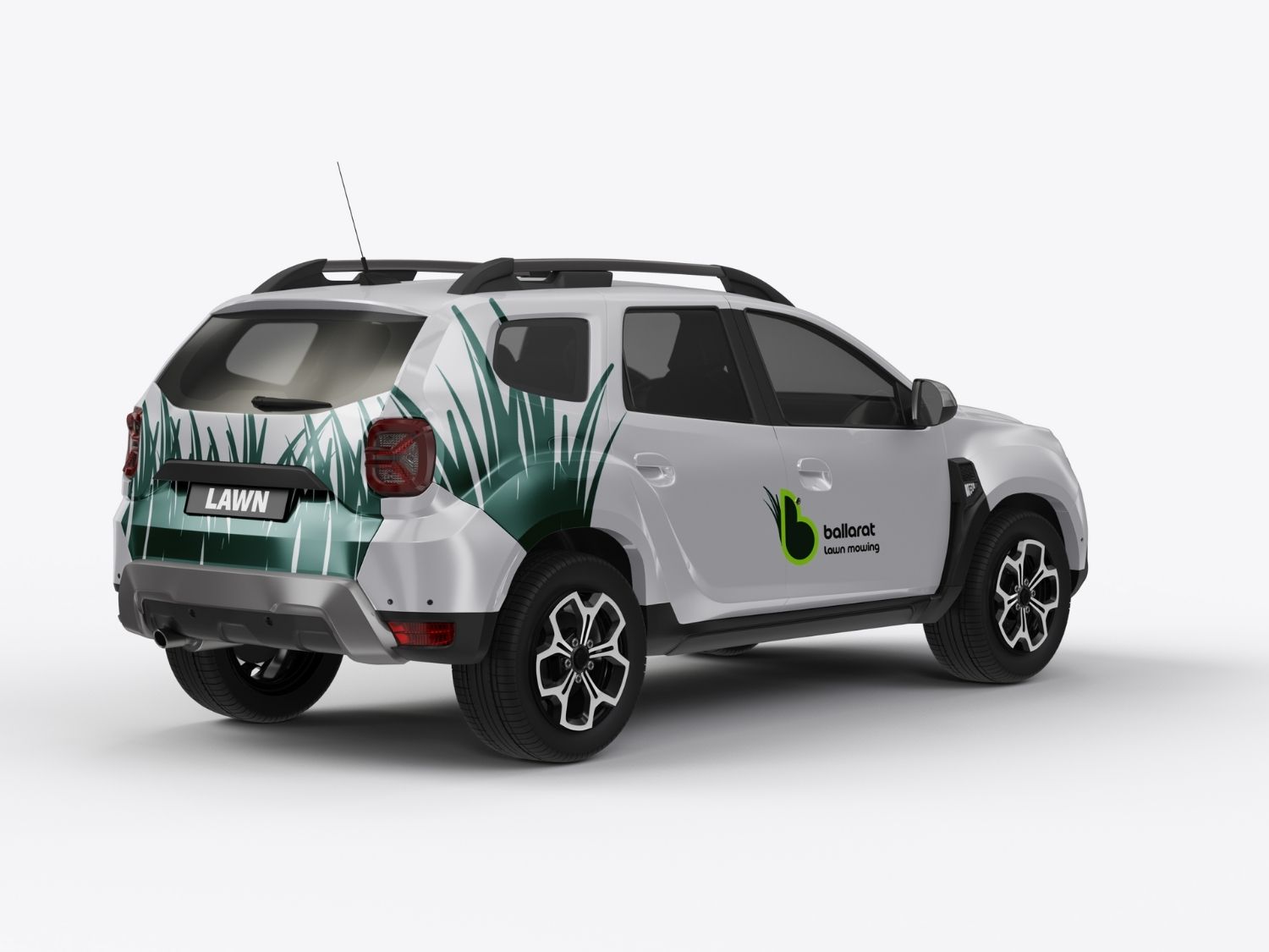
We redesigned the logo with a local-first focus, a stylised “B” doubling as a mower with clean grass blade lines, representing both precision and approachability.
A fresh mix of greens, charcoals, and whites balanced energy with professionalism, keeping the tone regional and grounded.
The visual system was delivered for print, signage, and digital use, with mock-ups for every channel.
This meant the new identity appeared everywhere consistently, from business cards to Facebook covers building recognition faster than traditional ad spend.
Instead of rebuilding from scratch, we restructured the existing site for technical SEO and conversion performance. This ensured every page worked harder to convert while staying technically clean for search indexing.

This was more than a facelift. It was a foundation project, where small, strategic design and SEO moves delivered big, lasting gains. Ballarat Lawn Mowing now has a trusted local brand, a performing website, and a solid technical base ready for content and conversion growth in 2026.
| Metric | Result | Impact |
|---|---|---|
| +22% Increase in Enquiries | From an average of 25 new client calls to 30 in 30 days | Clear proof that branding + CRO foundation lifts conversions |
| +30% Longer Session Times | Visitors engaged longer, exploring multiple pages | Stronger trust and credibility |
| Improved Local Recognition | More visibility through branded signage and cohesive identity | Higher offline enquiries and referrals |
Added Value
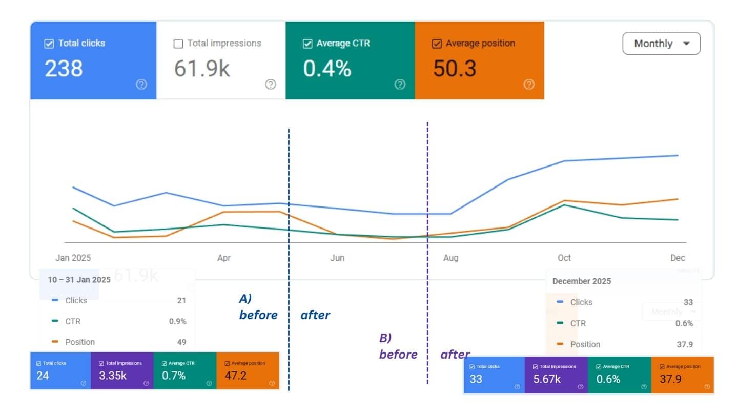
The rollout happened in phases between late April and July, allowing the business to manage investment gradually, but the results started showing as early as May, with a major visibility shift by August.
This project involved a brand and website refresh, Basic SEO foundations, and conversion-first design structure. No external backlinks, content campaigns, or active search optimisation were implemented – only clean architecture, schema setup, and CRO Best practice page design.
This is the power of getting the technical setup right. Even without blogging, ads, or backlinks:
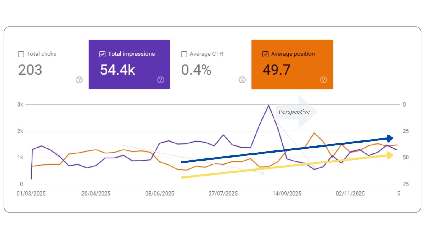
| Metric | Before (Q1 2025) | After (Q4 2025) | Change |
|---|---|---|---|
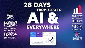
| Total Impressions | ~3.3K | 61.9K | +1,775% |
| Average Position | 49.7 | 37.9 | +24% Improvement |
| Total Clicks | 21 | 238 | +1,033% |
| Click-Through Rate (CTR) | 0.4% | 0.7% | +75% |
1. Technical SEO + Conversion Structure Drove Early Wins
Even without content campaigns, the improved meta structure, schema data, and site speed enabled Google to better understand and index the site. That’s why impressions surged within 60–90 days.
2. Average Position Improved 24% Despite No Link Building
Ranking improvement from position ~50 to ~38 shows strong technical health, when the foundation is solid, authority builds naturally over time.
3. CTR Increased Without Copy Changes
A 75% CTR boost suggests the meta titles and descriptions were rewritten for intent and clarity during setup, likely supported by stronger call-to-action phrasing.
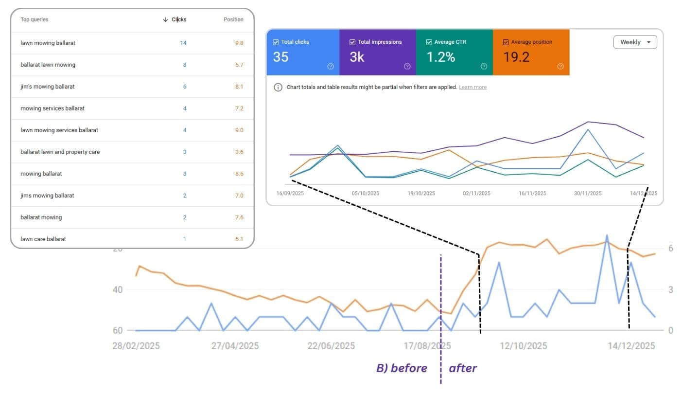
4. Local Keyword Visibility Strengthened
Top 10 local phrases now include:
This confirms schema and location signals are working, improving visibility in regional AI and Google Map Pack results.
5. Traffic Quality (CTR + Position Trends) Indicates “Trust Growth”
Position increases and rising CTR usually follow Google’s confidence curve, meaning Google now trusts the site enough to test it higher in SERPs.
Now that visibility is climbing, it’s time to turn that traction into real enquiry momentum.
Move into the Growth Phase with Visibility Sprints, short, targeted content building campaigns focused on Ballarat homeowners, renters, and property managers.
Publish 2–3 proof-based success stories and tighten existing service and blog pages to match local intent. Every page should help Google connect expertise with location.
Use GA4 insights to analyse scroll depth, button interactions, and form completions. Then test what converts best, adjusting CTAs, layouts, and offers to turn rising traffic into measurable leads.
Visibility in AI Overviews and Map Pack rankings depends on consistent, authentic reviews. Start asking every happy customer for one Google review per week. Over time, those reviews become trust signals that reinforce search visibility and click-through rate.
| Item | Description | (AUD) |
|---|---|---|
| Branding & Logo System | Concept development, logo design, and delivery Includes print, signage, and digital-ready formats, colour palette, typography. | $1,600 |
| Launch Website Refresh (CRO + SEO Foundations) | website redesign focused on conversion and visibility fundamentals | $2,800 |
| Total | Project Investment | $3,400 |


Discover how we’ve helped businesses transform their websites and SEO results. These case studies highlight real challenges, smart solutions, and measurable outcomes — designed to inspire your next move.


Hit submit and I’ll reach out by email or phone to help you get started. Your details stay private, see the Privacy Policy.