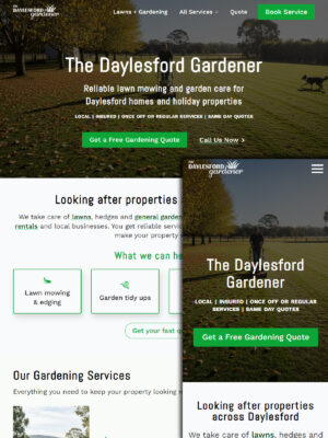
Daylesford Gardener Conversion Design
Originally launched in 2020, The Daylesford Gardener’s website has stayed…
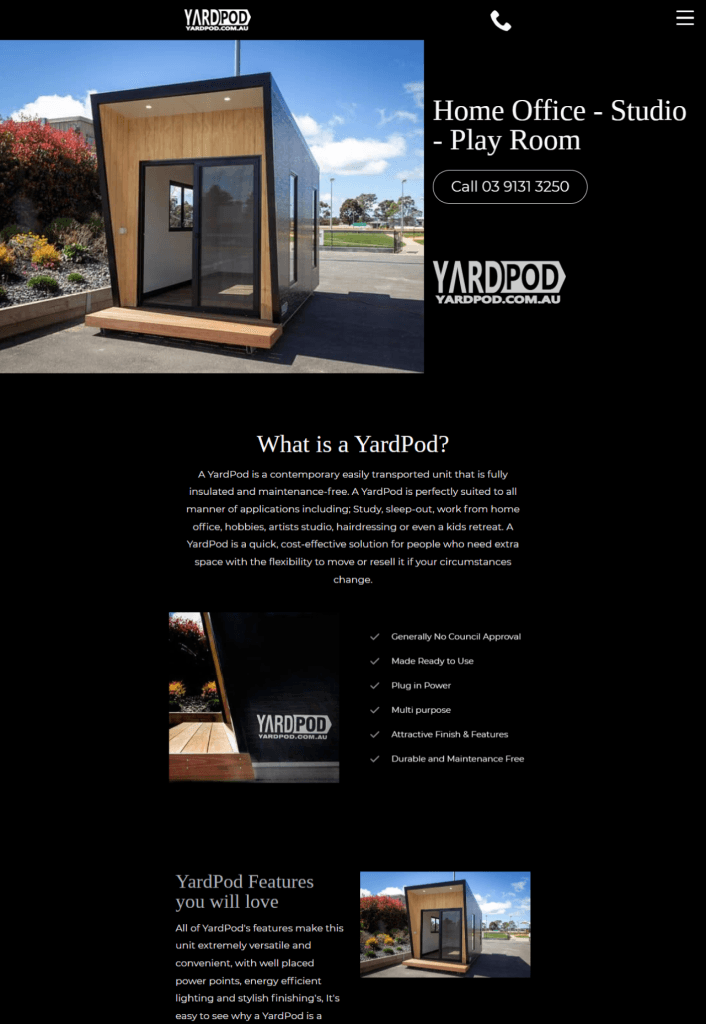
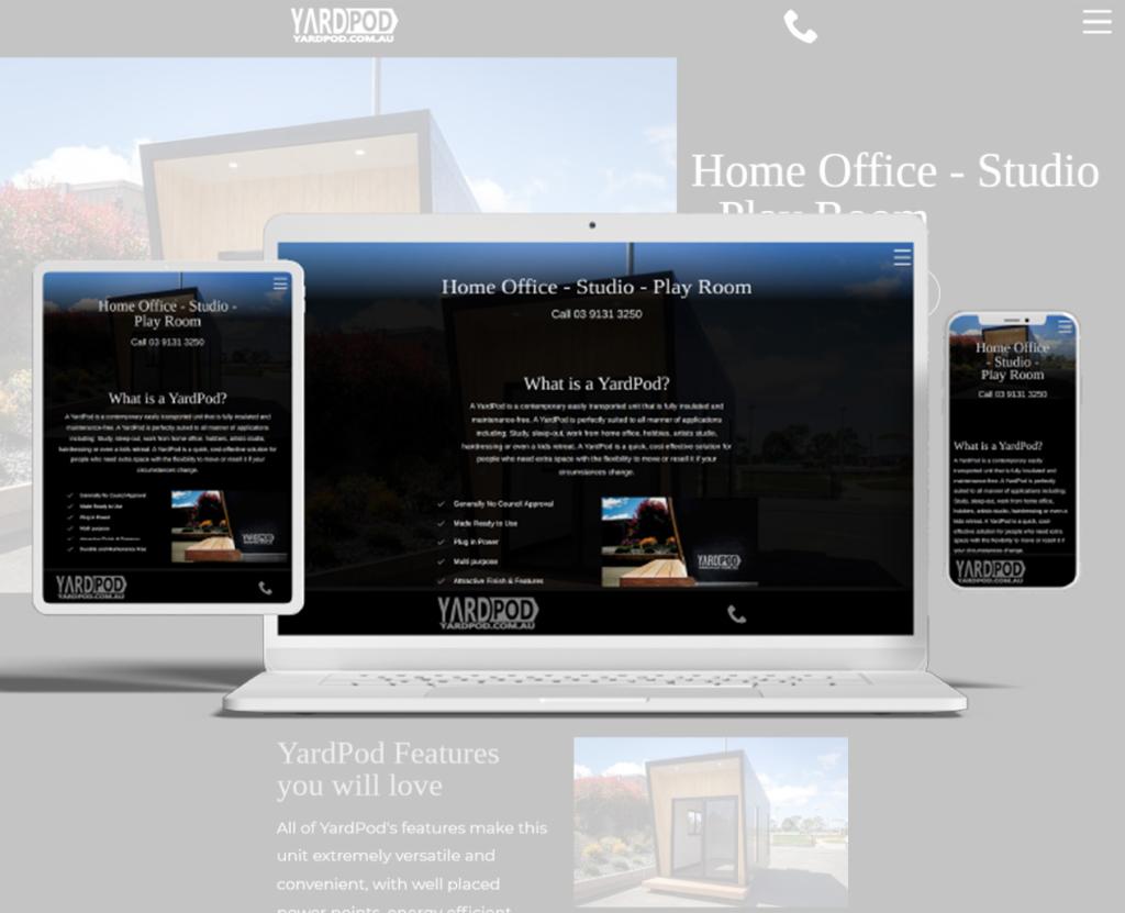
YardPod website is a simple website that reflected the quality of its premium portable living spaces. This one-page build focused on creating a visually strong experience with streamlined navigation, optimised performance, and technical foundations designed to support future visibility.
A streamlined one-page website built to highlight YardPod’s features, create a polished first impression, and give potential customers a clear path from interest to enquiry.
YardPod is a portable living space product created by Ryebucks Portables, designed to provide a compact, modern solution for additional living or usable space. As a new product offering, the goal wasn’t building a large website with complex functionality or multiple service pathways. The challenge was much simpler than that.
The business needed an online presence that immediately communicated quality and showcased the product in a way that matched its premium appearance.
When you’re introducing a product, first impressions carry a lot of weight. Visitors make assumptions quickly. If the presentation feels dated, cluttered, or difficult to navigate, confidence drops before the conversation even begins.
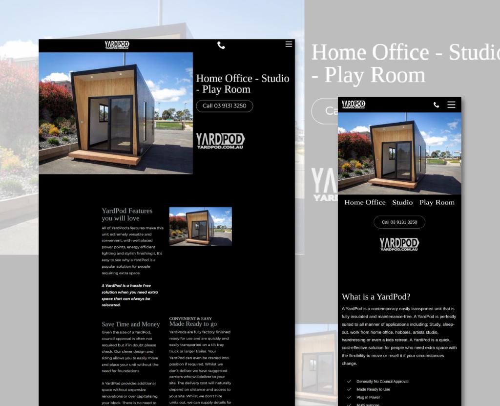
The requirement wasn’t a content-heavy website or a large eCommerce build. It needed to be visually strong, easy to navigate, mobile-friendly, and focused on helping potential customers understand the product without distraction.
Rather than spreading content across multiple pages, we focused on creating a single-page experience designed around simplicity and visual impact.
The goal was reducing friction and keeping visitors moving naturally through the information.
This project focused on delivering a clear, functional outcome rather than measurable growth metrics.
| Area | Outcome |
|---|---|
| Product presentation | Stronger visual alignment with premium positioning |
| User experience | Simple single-page browsing journey |
| Mobile experience | Responsive design across devices |
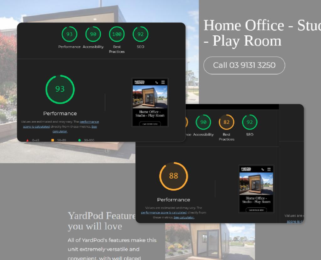
| Performance | Optimised images and caching improvements |
| Future visibility | SEO and analytics foundations implemented |
Simple projects still need strategy. The success of this build wasn’t adding more pages, animations, or features. By keeping the experience focused and removing unnecessary complexity, the product itself became the centre of attention rather than the website competing for it.
Single-page websites are often treated as temporary brochure sites. That wasn’t the goal here. The site was built as a focused product showcase designed to create confidence quickly, deliver a smooth user experience, and provide a stronger foundation for future growth if the product range expands.


Discover how we’ve helped businesses transform their websites and SEO results. These case studies highlight real challenges, smart solutions, and measurable outcomes — designed to inspire your next move.