Overview
Summary
Self-host your fonts, strip Google Fonts from loading twice, and preload only what's above the fold. Get your real .woff2 URLs from the Google Fonts CSS API or DevTools Network tab. Declare them in Breakdance's Global Stylesheet with font-display: swap. Turn off Google Fonts in both SCOS and LiteSpeed Cache. Aim for 2–3 weights per typeface — test for weight normalisation before loading duplicates. Document your font decisions in a typography contract comment block before you write a single @font-face rule.
Best Practice Setup for with Breakdance, Litespeed Cache & SCOS
Pick Your Fonts
For a more indepth Guide on actually picking the fonts see below
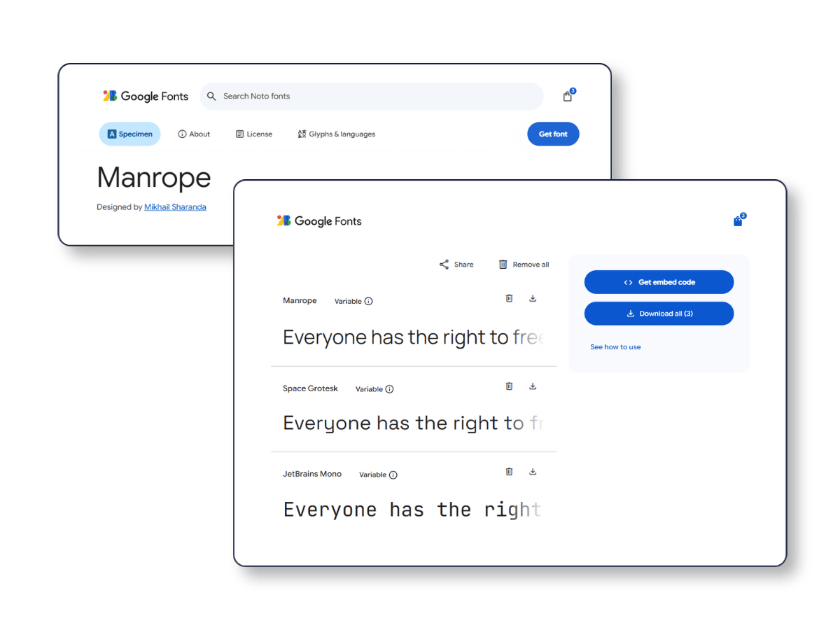
- https://fonts.google.com
- Get Font (repeat)
- Embed code
- Web
- @import
you will see
<style> @import url('https://fonts.googleapis.com/css2?family=JetBrains+Mono:ital,wght@0,100..800;1,100..800&family=Manrope:wght@200..800&family=Space+Grotesk:wght@300..700&display=swap'); </style>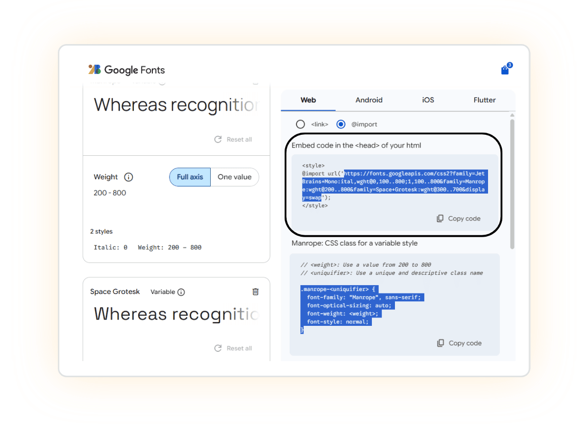
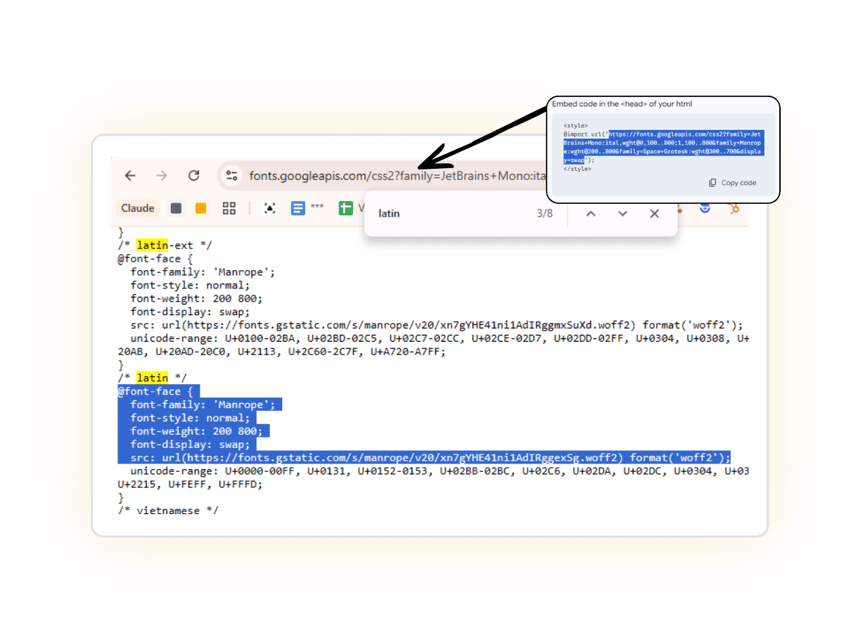
Grab the url and Visit https://fonts.googleapis.com/css2?family=JetBrains+Mono:ital,wght@0,100..800;1,100..800&family=Manrope:wght@200..800&family=Space+Grotesk:wght@300..700&display=swap
Copy /* latin */ Versions, usually you need Normal, (& italics) for any fonts used on site
eg/
@font-face{
  font-family: 'Manrope';
  font-style: normal;
  font-weight: 200 800;
  font-display: swap;
  src: url(https://fonts.gstatic.com/s/manrope/v20/xn7gYHE41ni1AdIRggexSg.woff2) format('woff2');
 }
@font-face{
  font-family: 'Space Grotesk';
  font-style: normal;
  font-weight: 300 700;
  font-display: swap;
  src: url(https://fonts.gstatic.com/s/spacegrotesk/v22/V8mDoQDjQSkFtoMM3T6r8E7mPbF4Cw.woff2) format('woff2');
 }
@font-face{
  font-family: 'JetBrains Mono';
  font-style: normal;
  font-weight: 100 800;
  font-display: swap;
  src: url(https://fonts.gstatic.com/s/jetbrainsmono/v24/tDbV2o-flEEny0FZhsfKu5WU4xD7OwE.woff2) format('woff2');
 }
Breakdance Global Fonts
Global > Stylesheet is a smart move
- Priority: Loads before most element-level CSS and custom per-element tweaks, so it acts like a base contract.
- Scope: Applies site-wide no need to repeat on every template.
- Portability: If you ever clone or export the site, this CSS travels with it.
- Clarity: Anyone who opens Breakdance later will immediately see the “Typography System” defined there.
Add Fonts to
Breakdance ▸ Global Settings ▸ Style Sheet
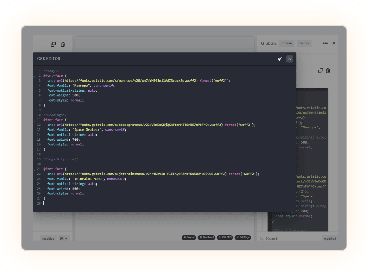
Example
/*Body*/
@font-face{
  src: url(https://fonts.gstatic.com/s/manrope/v20/xn7gYHE41ni1AdIRggexSg.woff2) format('woff2');
  font-family: "Manrope", sans-serif;
  font-optical-sizing: auto;
  font-weight: 500;
  font-display: swap;
  font-style: normal;
 }

/*Headings*/
@font-face{
  src: url(https://fonts.gstatic.com/s/spacegrotesk/v22/V8mDoQDjQSkFtoMM3T6r8E7mPbF4Cw.woff2) format('woff2');
  font-family: "Space Grotesk", sans-serif;
  font-optical-sizing: auto;
  font-weight: 700;
  font-display: swap;
  font-style: normal;
 }

/*Tags & Eyebrow*/

@font-face{
  src: url(https://fonts.gstatic.com/s/jetbrainsmono/v24/tDbV2o-flEEny0FZhsfKu5WU4xD7OwE.woff2) format('woff2');
  font-family: "JetBrains Mono", monospace;
  font-optical-sizing: auto;
  font-weight: 400;
  font-display: swap;
  font-style: normal;
 }
font-display: swap
If you’re not already forcing this on every @font-face declaration, add it. It prevents invisible text during font load and improves perceived speed. It’s already included in the Google Fonts API when you append &display=swap to the URL — but if you’re writing @font-face manually (which this workflow requires), you need to add it explicitly:
SCOS Settings
Performance ▸WordPress Tweaks ▸Remove Google Fonts
[ON] Dequeues and strips all fonts.googleapis.com stylesheet links from the page
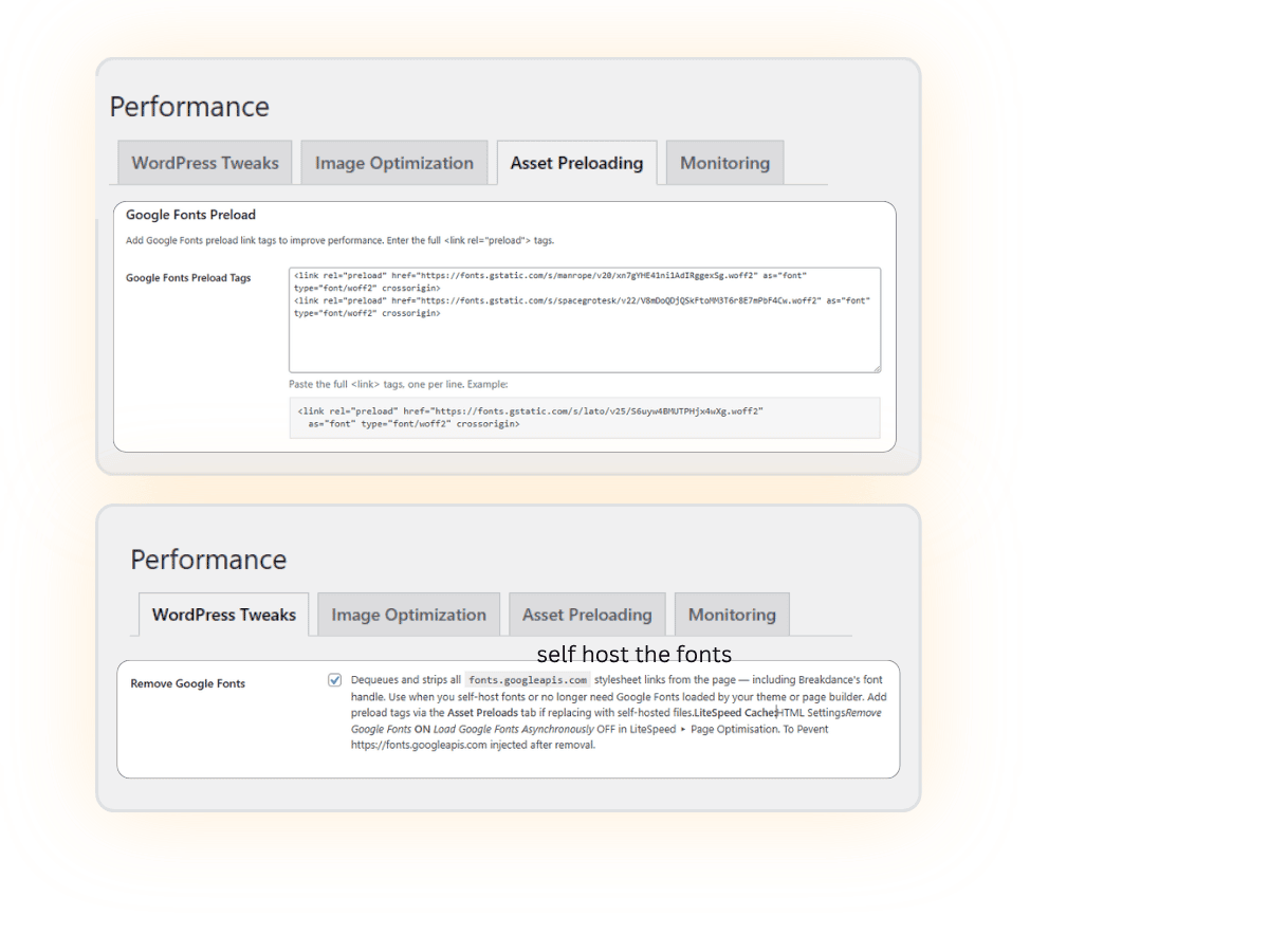
Dequeues and strips all fonts.googleapis.com stylesheet links from the page — including Breakdance’s font handle. Use when you self-host fonts or no longer need Google Fonts loaded by your theme or page builder.
Add preload tags via the Performance ▸ Asset Preloads ▸Google Fonts Preload if replacing with self-hosted files.
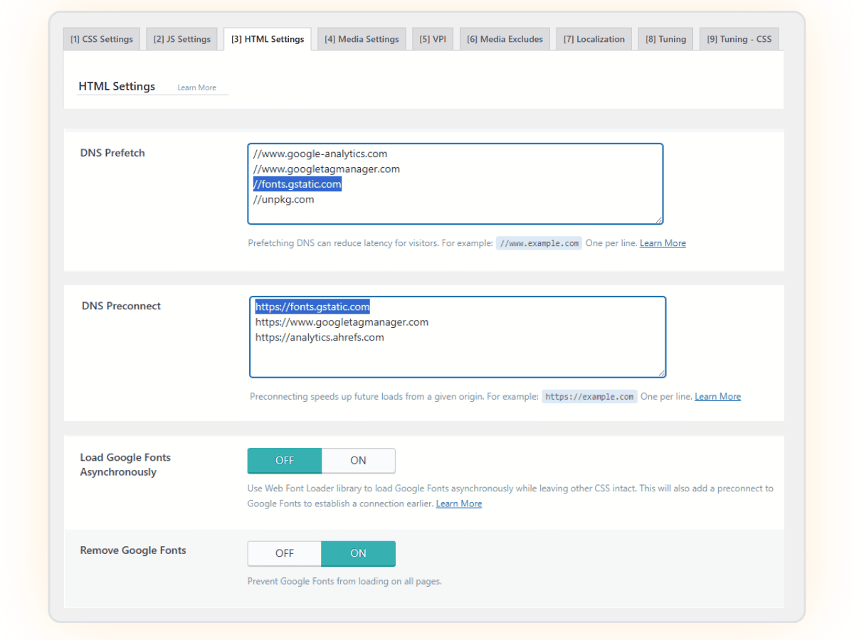
LiteSpeed Cache▸Page Optimisation ▸ HTML Settings ▸ Remove Google Fonts ON; Load Google Fonts Asynchronously OFF To Pevent https://fonts.googleapis.com injected after removal.
Performance ▸ Asset Preloads ▸Google Fonts Preload
Not every font weight needs a preload tag. If a font renders without a visible jump or layout shift, it’s not contributing to CLS and preloading it adds unnecessary overhead. see CLS Rule of Thumb – When You Don’t Need to Preload
<link rel="preload" href="https://fonts.gstatic.com/s/manrope/v20/xn7gYHE41ni1AdIRggexSg.woff2" as="font" type="font/woff2" crossorigin>
<link rel="preload" href="https://fonts.gstatic.com/s/spacegrotesk/v22/V8mDoQDjQSkFtoMM3T6r8E7mPbF4Cw.woff2" as="font" type="font/woff2" crossorigin>
LightSpeed Cache
LiteSpeed Cache ▸ Page Optimisation ▸ HTML Settings
- DNS Prefetch ▸ //fonts.gstatic.com
- DNS Preconnect ▸ https://fonts.gstatic.com
- Remove Google Fonts ▸ ON
- Load Google Fonts Asynchronously▸ OFF
Even more Optimisation
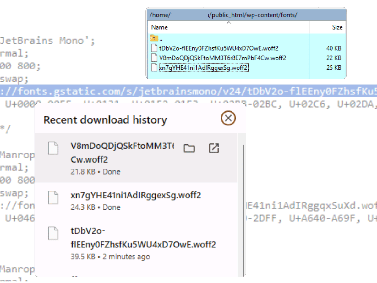
Take it 1 step further and self host the fonts. 5-10 minute job. It’ll clean up the dependency chain completely
The declarations are still fetching from fonts.gstatic.com — external dependency still exists. The preload + preconnect mitigates it significantly, but you’re still at Google’s mercy for those woff2 files.
If you want to take it one step further – This is now the right time to properly self-host them since you have the exact URLs.
Three files to download would be
https://fonts.gstatic.com/s/manrope/v20/xn7gYHE41ni1AdIRggexSg.woff2
https://fonts.gstatic.com/s/spacegrotesk/v22/V8mDoQDjQSkFtoMM3T6r8E7mPbF4Cw.woff2
https://fonts.gstatic.com/s/jetbrainsmono/v24/tDbV2o-flEEny0FZhsfKu5WU4xD7OwE.woff2
Download all three, upload to /wp-content/fonts/ (create the folder if you need to), then update your @font-face in breakdance global settings Style Sheets and preload tags to:
css
src: url(/wp-content/fonts/xn7gYHE41ni1AdIRggexSg.woff2) format('woff2');html
<link rel="preload" href="/wp-content/fonts/xn7gYHE41ni1AdIRggexSg.woff2" as="font" type="font/woff2" crossorigin>Then remove fonts.gstatic.com preconnect and dns-prefetch entirely — zero external font dependencies.
From the fonts.gstatic.com urls you just Paste https://fonts.gstatic.com/s/manrope/v20/xn7gYHE41ni1AdIRggexSg.woff2 into browser it will download – you can rename them if you like
/* latin */
@font-face{
  font-family: 'Manrope';
  font-style: normal;
  font-weight: 200 800;
  font-display: swap;
  src: url(https://fonts.gstatic.com/s/manrope/v20/xn7gYHE41ni1AdIRggexSg.woff2) format('woff2');
 }
Font Optimisation Decisions
What to Actually Load
A deliberate, minimal font system reduces network requests, improves Core Web Vitals, and ensures text renders predictably. As a general rule, aim for 2–3 weights per typeface and preload only those used above the fold.
Finding the real .woff2 URLs via DevTools
If you need to verify exactly which font files are being loaded (useful mid-build, or when a font URL may have changed):
CLS Rule of Thumb
When You Don’t Need to Preload
- The weight is used in a large block of above-the-fold text (hero heading, nav links)
- It’s critical for layout stability — i.e. swapping it in would shift container dimensions
You can skip preloading when:
- The weight is used below the fold only
- It renders without visual jump (e.g. a button font that’s close enough to the fallback)
The 600-weight button on brighterwebsites.com.au is a real example of this — it doesn’t cause a CLS, so it doesn’t need a preload tag.
Weight Normalisation – Drop the Duplicates
Some typefaces visually snap to certain optical weights due to hinting or design decisions. This means loading 400 and 500 often gives you identical rendering — you’re making two network requests for the same visual result.
Check whether adjacent weights look different at your actual used sizes before loading both. In practice, most sites can reduce to: 300, 400, 600, 800 — dropping 500 and 700.
Italics: When to Preload, When to Skip
✅ If italics are used in H2–H6 elements below the fold, no preload needed — no performance or UX issue.
Avoid using italics in the hero or primary headings (H1/H2 above the fold) unless they’re preloaded — that’s where a flash or layout shift is possible.
If italics appear often site-wide (blog quotes, pull-quotes, section titles), load them as part of your standard @font-face declaration with font-display: swap rather than preloading separately.
- Open DevTools → Network tab
- Reload the page with “Disable cache” checked
- Filter by Font type
- The
.woff2files loading are your real URLs — copy directly from the request
This is the source-of-truth method. Google’s CSS API can serve different files depending on the browser user agent, so what you see in the @import URL isn’t always what actually loads.
Font System Planning
Before you write a single @font-face declaration, map out your font system. This keeps weight count low and makes preload decisions obvious.
| Role | Font | Weights | Above the Fold | Preload | Notes |
|---|---|---|---|---|---|
| Headings (H1–H3) | Kantumruy Pro | 300, 800 | ✅ Yes | ✅ Yes | 300 is default global weight; 800 for emphasis |
| Body text | Lato | 400 | Occasional | ✅ Yes | Core content — always preload |
| Buttons & CTAs | Kantumruy Pro | 600 | Sometimes | ❌ No | Skip preload unless used in hero CTA |
| Navigation | Kantumruy Pro | 800 (desktop), 400 (mobile) | ✅ Yes | ✅ Yes | Critical ATF — preload recommended |
| Editorial / Blog body | Playfair or Lora | 400 | ❌ No | ❌ No | Post content only; no preload needed |
| Tags / Eyebrow labels | Third font (optional) | 400 only | ❌ No | ❌ No | Small scale, never ATF — no preload ever |
💡 Once finalised, treat this as a font contract for the project. Any new elements or pages must conform to it — or the decision to deviate should be documented.
Typography Contract Comment Block
Drop this at the top of your Breakdance Global Stylesheet as a reference anchor. It takes 30 seconds and saves future-you (or a handoff recipient) from having to reverse-engineer the decisions.
css
/* ----------------------------------------------
📐 TYPOGRAPHY PLAN/CONTRACT - Global Type System
-------------------------------------------------
- H1–H6:           300 (Kantumruy Pro)
- Body:            400 (Lato)
- Button:          600 (Kantumruy Pro)
- Heading emphasis: 800 (Kantumruy Pro)
- Italics:         Below the fold only
- Third font:      Tags/eyebrows at small scale, never ATF
------------------------------------------------- */