Service businesses need A conversion-focused website that quickly explains:
who you help
what you provide
where you work
why someone should trust you
what they need to do next
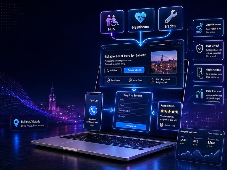
For NDIS, healthcare and trade businesses, that means clear service pathways, genuine proof, simple mobile actions and fewer points of hesitation. Then, once the site is live and receiving real traffic, GA4 and enquiry tracking can show where people engage, where they stop and which pages produce worthwhile leads.
Build it to convert first. Optimise with analytics data as evidence to iterate and improve second.
Table Of Contents
A professional-looking website isn’t enough. It needs to generate enquiries, calls, bookings and quote requests.
For Ballarat’s NDIS providers, healthcare practices and tradie businesses, conversion website design means making it clear who you help, what you offer, why you’re credible and what the visitor should do next.
Because the final decision usually happens offline, the website’s job is to start the right conversation. That might be a support enquiry, an appointment booking, a site visit or a quote request.
The goal is simple: reduce hesitation and make the next step obvious.
Conversion website design comes before conversion optimisation
There are two different stages here, and they’re often confused.
Stage one: build the conversion foundation
The first stage uses established conversion principles to create a website that is ready to generate enquiries from launch.
That includes clear navigation, useful service pages, trust signals, mobile usability, calls to action and an enquiry process that matches how the business actually handles new customers.
You don’t need six months of analytics to know that a hidden phone number is unhelpful.
You don’t need a heatmap to know that a fourteen-field quote form will frustrate someone standing on a job site.
And you don’t need behavioural data to know that “Welcome to our website” tells a potential client almost nothing.
Some decisions are simply good website infrastructure.
Stage two: improve the site using real behaviour
Once the website has been launched correctly, measurement becomes far more useful.
GA4 can record meaningful actions such as form submissions and show the paths visitors take before completing them. Google recommends lead-generation events for businesses where the final conversion can happen online or offline. s second stage can help answer questions such as:
Which service pages generate enquiries?
Do visitors start forms but fail to submit them?
Are people calling from mobile devices?
Which traffic sources bring qualified leads?
Where do users leave the website?
Are enquiries turning into booked work?
That data can guide better decisions.
But data can’t rescue a website that never had a clear message, credible proof or usable enquiry pathway in the first place.
What all three industries have in common
NDIS providers, healthcare practices and tradies serve very different people.
Their websites still share the same basic job.
They have to reduce uncertainty.
A visitor is usually asking several questions at once:
“Do you provide what I need?”
“Do you work in my area?”
“Can I trust you?”
“Will this be difficult?”
“What happens after I contact you?”
When those answers are buried, vague or missing, the visitor has to work harder. Most won’t.
They’ll go back to Google and open the next result.
A conversion-focused service website should therefore provide five things early.
1. Immediate relevance
The opening section should identify the service, audience and location without making people decode a clever slogan.
A Ballarat participant looking for in-home support needs to know they’ve reached the right provider.
A patient needs to see the relevant treatment or practitioner.
A property owner needs to know whether the business handles their type of project and services their suburb.
Clarity wins that first small decision: stay or leave.
2. A visible next step
Not every visitor is ready to complete the same action.
One person wants to call. Another needs to read about the process. Someone else is comparing providers and wants to check qualifications, service areas or pricing before they make contact.
That means a website may need more than one conversion path:
call now
request a quote
book online
ask about availability
check eligibility
view services
learn how the process works
The action should fit the person’s readiness rather than forcing everyone into one form.
3. Proof close to the claim
Anyone can write “trusted”, “experienced” or “high quality”. Those words mean very little by themselves. better proof includes:
real team and project photographs
qualifications and registrations
relevant memberships
years of practical experience
case studies
client outcomes
service-area knowledge
a clear explanation of the process
Proof works best when it appears beside the statement it supports, not hidden on a page nobody visits.
4. Mobile-first contact
Many service-business enquiries happen on a phone. The visitor may be sitting in a car, standing outside a property, helping a family member or trying to find an appointment during a lunch break.
The website needs readable text, obvious buttons, tap-to-call actions and forms that don’t feel like paperwork. Every unnecessary field creates another opportunity to abandon the enquiry.
5. A clear handover to the real sales process
A form submission isn’t a completed conversion when the business closes its sales offline.
It’s a handover.
The website should set expectations about what happens next:
when the business will respond
who will make contact
whether an assessment or site visit is required
what information the customer should prepare
how quotes, bookings or service agreements work
That small explanation can remove a surprising amount of hesitation.
What an NDIS provider website should include
NDIS websites carry a heavy trust and clarity burden. Participants, families, carers, support coordinators and plan managers may all visit the same site, but they aren’t necessarily looking for the same information.
They may need to know:
which supports are available
who is eligible
which age groups or needs are supported
whether the provider is registered
which funding arrangements are accepted
where services are delivered
whether there is current capacity
how to make a referral or enquiry
The website needs to make those answers easy to find.
The official NDIS Provider Finder includes provider website, phone, email and location details, which means your website may be the next major trust check after someone finds your organisation. ’t waste that visit with generic language about “empowering journeys”.
Say what the service involves. Explain who delivers it. Show the real team where consent allows. Clarify the suburbs or regional areas covered. State whether services happen at home, in the community, by telehealth or at a physical location.
Registration also needs careful wording. NDIS providers may be registered or unregistered, while the NDIS Code of Conduct applies to both. A website shouldn’t imply a registration status the provider doesn’t hold. strongest NDIS enquiry paths are usually low pressure:
Check current availability
Ask about support options
Make a referral
Talk to our team
Find out whether we’re a good fit
People are often making an important and personal decision. The website should make that decision feel clearer, not more complicated.
What a healthcare website needs to do differently
Healthcare conversion is built around confidence.
Patients may be worried, uncertain, uncomfortable or simply overwhelmed by too much information. They need a website that feels calm and credible without making promises it can’t support.
The essentials include:
accurate practitioner names and qualifications
clear treatment or service information
locations and opening hours
transparent booking instructions
fees or payment information where appropriate
referral requirements
accessibility details
privacy-conscious forms
realistic explanations of what to expect
Healthcare copy also has regulatory boundaries.
For regulated health services, AHPRA advertising requirements prohibit testimonials about the clinical aspects of a service. Claims about effectiveness must be supported by acceptable evidence and must not mislead the public. t doesn’t mean a healthcare website has to sound sterile.
It means trust needs to be built through accurate information rather than exaggerated promises.
You can still show the environment, introduce the team, explain the appointment process and help patients understand what will happen next.
In fact, those details often matter more than another paragraph claiming the practice “puts patients first”.
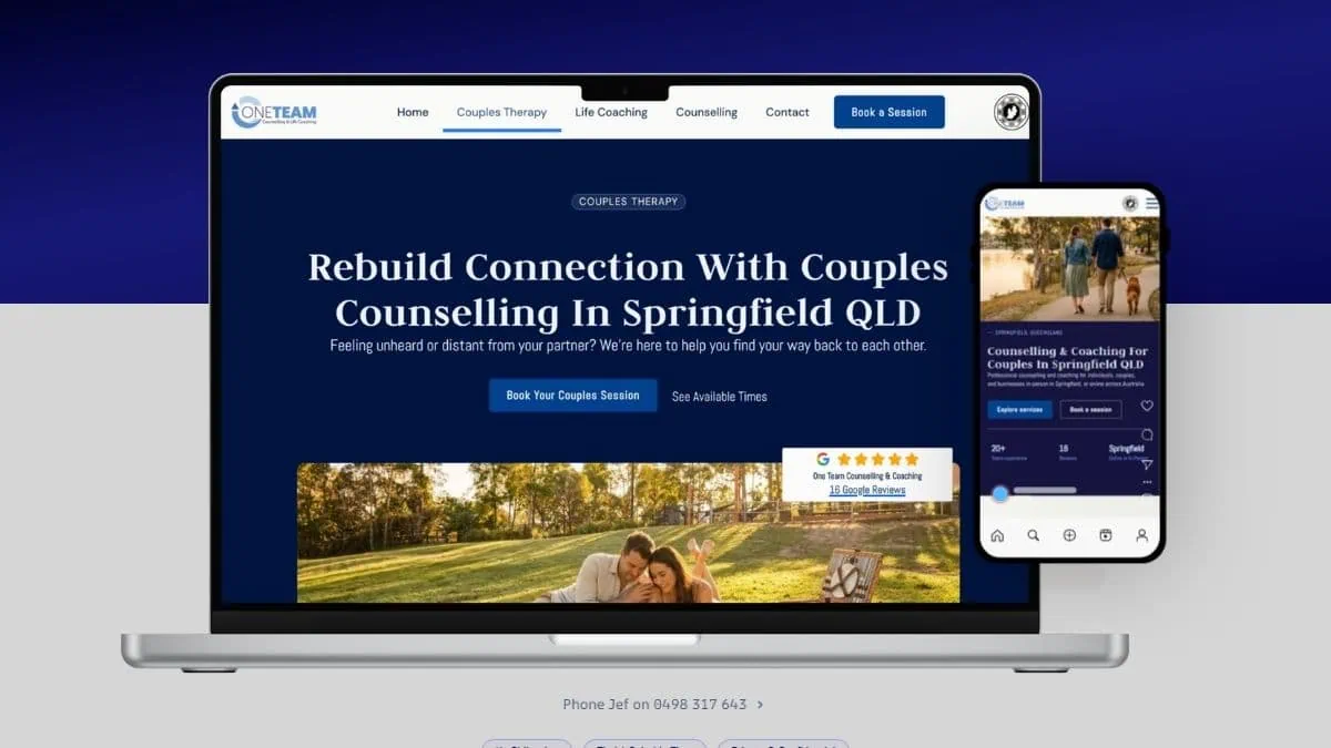
Brighter Websites saw this in the One Team Counselling and Coaching project. The site didn’t simply need more traffic. It needed warmer messaging, clearer calls to action, local photography, better-positioned FAQs and a less frustrating mobile booking path.
The result was a reported 35% increase in online bookings. Users were also reaching the primary conversion action within two to four clicks, typically within two minutes and forty-five seconds of entering the site. a flashy redesign.
A better decision-making journey.
What helps a tradie website generate better quote requests
Tradie websites often have the opposite problem.
There’s plenty of visual proof, but not enough structure.
A gallery may show impressive work without explaining what the business actually handles, where it travels or what information is needed for a quote.
That creates poor-fit leads.
A strong trade or construction website should quickly answer:
What type of work do you take on?
Do you handle residential, commercial or both?
Which areas around Ballarat do you service?
Are there minimum job sizes?
Do you provide repairs, installations or complete projects?
What qualifications, licences or insurances apply?
What happens after someone requests a quote?
Real project photography is particularly valuable here. Not just finished glamour shots. Show the work in context. Include project types, locations, materials, constraints and the problem that was solved.
That helps a potential customer recognise, “They’ve done work like mine before.”
The quote form should collect enough information to qualify the enquiry without becoming a tender document.
For many businesses, that might include:
name and contact details
suburb
type of work
approximate timeframe
a short description
optional photo or plan upload
Then give people another route.
Some will call. Some will text. Some need to send photographs before either side knows whether a site visit is worthwhile.
Design around the real quoting process, not around whichever form template came with the website.
The launch-ready conversion checklist
Before a Ballarat service website goes live, it should pass a practical test. Can a new visitor quickly understand the business and take an appropriate next step? At minimum, check that the website has:
Clear positioning
The homepage states who the business helps, what it provides and where it operates.
Separate service information
Important services have enough detail to answer the visitor’s main questions. They aren’t squeezed into three vague boxes on the homepage.
Relevant trust signals
Qualifications, registrations, memberships, reviews, case studies and genuine photographs appear where they’re useful.
Local detail
Ballarat and surrounding service areas are described naturally, with proof the business genuinely works in those communities.
Several sensible calls to action
Visitors can call, book, ask a question or request a quote depending on the service and their readiness.
A usable mobile experience
Buttons are easy to tap, text is readable and forms don’t demand unnecessary effort.
Clear expectations
The site explains what happens after an enquiry, including response times and the next stage of the process.
Reliable tracking
GA4, form tracking and other required measurement tools are configured before launch so useful baseline data starts accumulating immediately.
Why GA4 comes after the strategy, not instead of it
GA4 should be installed from launch. Its what we do for all sites regardless, But optimisation decisions need enough traffic and enough completed enquiries to reveal a meaningful pattern.
A week of random page views or listening to feedback from a couple colleges or friends isn’t a conversion strategy. For service businesses, the most useful measurements usually include:
visits to high-value service pages
contact-page views
click-to-call actions
booking-button clicks
form starts
form submissions
quote requests
referral submissions
traffic source
device type
landing page
qualified leads
sales or bookings resulting from those leads
Google Analytics allows important actions to be marked as key events. It can also show the steps between entering the site, viewing a form, starting it and submitting it. t’s helpful.
Still, the most important data may live outside GA4.
A tradie may receive ten quote forms but discover that only two fit the business.
A healthcare practice may increase bookings but attract appointments for a service with no current capacity.
An NDIS provider may generate more referrals while repeatedly receiving enquiries from outside its service area.
That’s why website data needs to be compared with real business outcomes.
More leads isn’t always the goal.
Better-fit leads usually are.
Build the foundation. Then improve what people actually use.
A conversion-focused website isn’t finished at launch.
It’s ready at launch.
The first build should be based on sound structure, clear information, credible proof and an enquiry flow that reflects the way your business operates.
Then the website starts collecting evidence.
You see which services draw attention. Which pages create calls. Which forms lose people. Which enquiries turn into real work.
And you improve from there.
For Ballarat’s NDIS providers, healthcare businesses and tradies, that staged approach is far more useful than endlessly redesigning a website based on opinions.
Build it to make sense. Launch it with proper measurement. Then let real customers show you what needs to change.
Frequently asked questions
What makes a service business website convert better?
A better-converting service website clearly explains the service, audience, location, proof and next step. It also reduces mobile friction and matches the enquiry process to the way the business follows up and closes work offline.
What should an NDIS provider website include?
It should clearly describe the supports offered, service locations, intended participants, funding or registration information, current availability and the referral or enquiry process. The information should work for participants, families and professional referrers.
How can a healthcare website build trust without overclaiming?
Use accurate qualifications, practitioner information, service explanations, genuine team photography and a clear booking process. Avoid unsupported outcome claims and testimonials about the clinical aspects of regulated health services.
What website features help tradies get more quote requests?
Clear service and location pages, real project examples, tap-to-call buttons, short quote forms, optional photo uploads and an explanation of what happens after the request can all improve the quoting experience.
When should GA4 optimisation begin?
GA4 should collect data from launch. Deeper optimisation should begin once there is enough traffic and enquiry information to identify useful patterns. Website events should also be compared with lead quality, bookings, quotes and completed sales.
Ready for a website that does more than look professional?
Brighter Websites designs conversion-focused websites for Ballarat and regional service businesses.
We start with the structure: your services, customers, trust signals and offline sales process. Then we build the measurement foundation needed to improve the website using real behaviour and enquiry data.
Book a website consultation to find out where your current enquiry path is helping, where it’s creating friction and what should be fixed first.
Subscribe to our blog or get in touch.
Get in touch with with Vanessa. Your Ballarat website strategist, designer and developer.
Occasional emails from Vanessa at Brighter Websites about AI, SEO, Website Marketing for regional service businesses.
See what we have done
More Articles
Discover more expert insights to the latest Web Design and SEO trends, these curated blog posts are designed to broaden your horizons and spark your imagination.